The Photographic Community for Users of Olympus and OM system micro 4/3 digital cameras and E-series DSLRs
| Home | Login |
Search
Forum
Actions
New Document
New Folder
List Folders
List Documents
List Groups
List Users
Camera resources
Olympus 4000
Olympus 4040
Olympus 5050
Olympus 5060
Olympus 7070
Olympus 8080
Olympus E-M1 II
Olympus E-M5
Olympus E-P1
Olympus E-P2
Olympus E-PL1
Olympus E-PL3
Olympus E1
Olympus E3
Olympus E30
Olympus E300
Olympus E330
Olympus E400
Olympus E410
Olympus E420
Olympus E500
Olympus E510
Olympus E520
Olympus E620
m4/3 lenses
Camera FAQs
Terms of Service
Photo contest
Submissions page
Hall of fame
Folders
About this site
Documents
Polls
Private folders
Public folders
Categories
Abstract
Action/Motion
Animal
Architecture
Candid/Snapshot
Cities/Urban
Documentation
Fashion/Glamour
Historical
Landscape
Macro
Miscellaneous
Nature
Night/Low light
People
Polls
Sand and Sea
Sky
Tourist/Travel
Contact Us
The Game
| Photographer: | Sergey Green |
|---|---|
| Folder: | sngreen |
| Uploaded: | 14-Jan-2007 18:10 CET |
| Current Rating: | 9.50/4 View all ratings Delete my rating |
| Model release available: | |
| Camera: | Olympus E500 |
| Exposure time: | 2 s |
| Aperture: | f/3.2 |
| Focal length: | 147 mm |
| Lens: | 50-200 |
| Focusing method: | |
| ISO: | 100 |
| White balance: | Auto |
| Flash: | no |
| Image format: | RAW |
| Processing applied: | |
| Various: | |
| Image resized to: | 661x900 |

More info please.
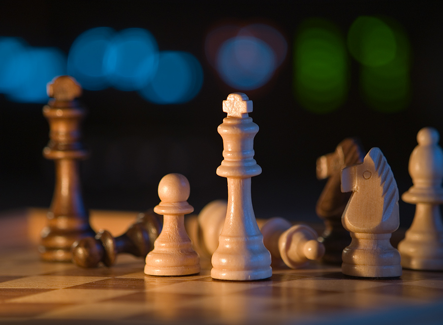
Very nice Sergey. Without any notes under various one has to guess as to what you have done to achieve this shot. Without giving away the store you could share a little more info! The three light source works very well here with either gels or coloured lights to the right and in BG with limited DOF and low POV. I would like to draw my fellow My Olympians attention to this critique. I have stated that (A) I like the shot. (B) What specifically I like. (C) Have left a rating. And (D) have requested more information. This folks is how it?s done. Again Sergey, good stuff indeed.
Randall Beaudin at 19:56 CET on 14-Jan-2007 [Reply]
effective viewpoint
The low angle and shallow DOF combine to produce an effect I like. Personally I would work at minimizing or eliminating the shadow which falls on the knight in focus on the right as I find it distracting. I often retain my impression when I first view an image since most images don't get much more then a qlance unless they grab your attention at first sight
regards, bert
Donald Bryant at 20:27 CET on 14-Jan-2007 [Reply]
Details,details!
Donald Bryant wrote:
> The low angle and shallow DOF combine to produce an effect I like. Personally I would work
> at minimizing or eliminating the shadow which falls on the knight in focus on the right as
> I find it distracting. I often retain my impression when I first view an image since most
> images don't get much more then a qlance unless they grab your attention at first sight
>
> regards, bert
>
You brought up a good point Bert. Sergey, if you had just moved that Knight forward slightly that would have taken care of that. Now you can see Sergey that a "simple" shot can be demanding eh! Photography is like wood working..measure twice, cut once! It's easy to overlook a little detail like that.
Randall Beaudin at 20:36 CET on 14-Jan-2007 [Reply]
NO SUBJECT
Nice shot! good light and composition! Best Regards
Sergio Di Giovanni at 21:46 CET on 14-Jan-2007 [Reply]
NO SUBJECT
Randall Beaudin wrote:
> Very nice Sergey. Without any notes under various one has to guess as to what you have done
> to achieve this shot. Without giving away the store you could share a little more info! The
> three light source works very well here with either gels or coloured lights to the right and
> in BG with limited DOF and low POV. I would like to draw my fellow My Olympians attention
> to this critique. I have stated that (A) I like the shot. (B) What specifically I like. (C)
> Have left a rating. And (D) have requested more information. This folks is how it?s done.
> Again Sergey, good stuff indeed.
>
Thanks Randal and Donald. The source of light is a slightly open curtain - I was intentionally looking for shadows in hopes to create an impression that I am as tall (or rather as small) as the figures are. I saw shadows as plus, basically, rather than destructing. The background light is a receiver (h/k avr-700) - not only does it produce great sound but good photographic backgrounds at times as well ;)
http://www.hometheatermag.com/receivers/43/
The blue lights are "CD", "DVD", whatever; the blue with reds around is speakers setup; and the green lights are the "Source".
I did try tamron lens at first, but then realized the magnified perspective did look more sensational (if I may say so) with longer lens (as 50-200) instead.
Thanks for looking and commenting.
- Sergey
Sergey Green at 11:07 CET on 15-Jan-2007 [Reply]
NO SUBJECT
Nice shot Sergey
Richard Ociepka at 20:06 CET on 15-Jan-2007 [Reply]
NO SUBJECT
Great shot, perspective and lighting. Love it.
Gabriele Swanson at 02:23 CET on 16-Jan-2007 [Reply]